
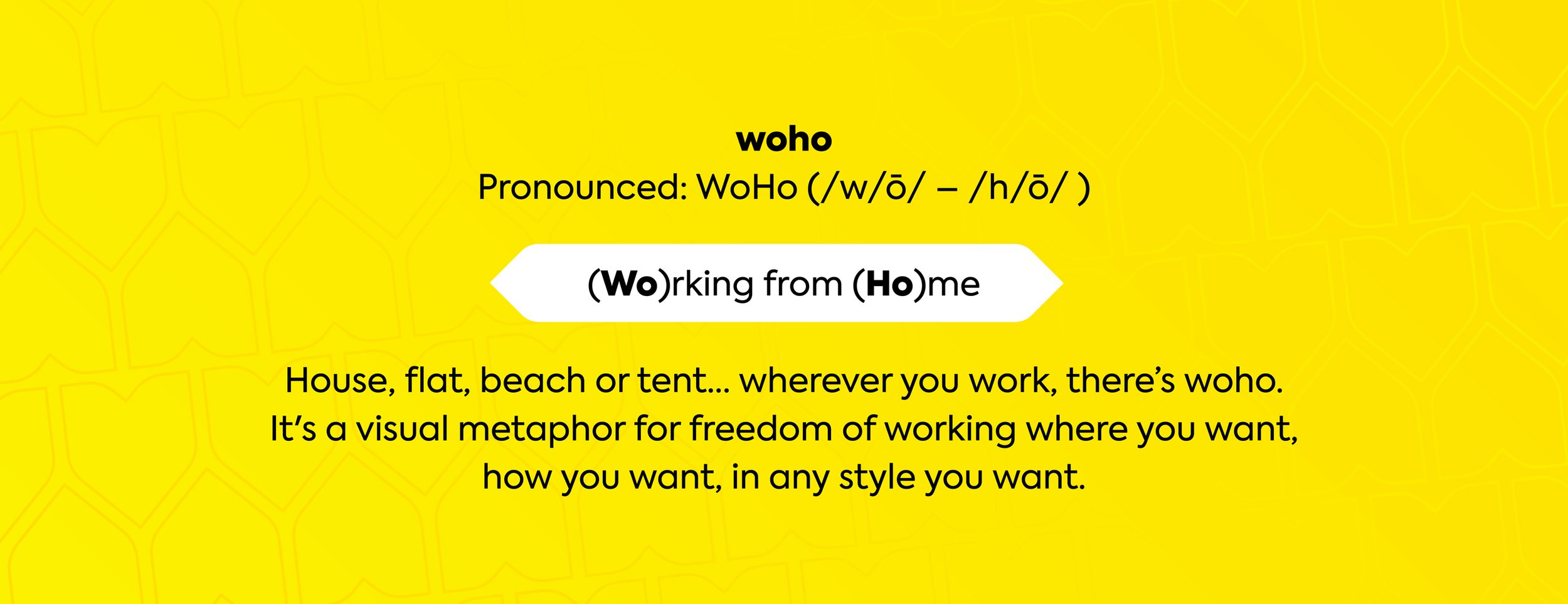
Woho
Revolutionising the way people work from home.
Brand Identity Roll-Out

The business challenge
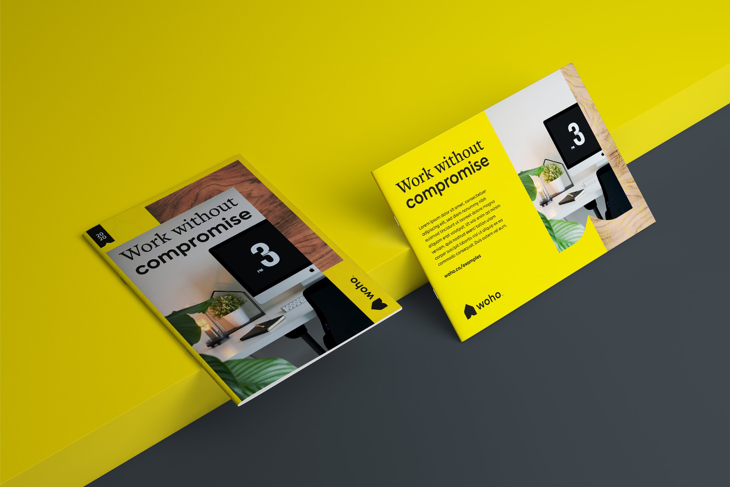
We worked in collaboration with Bourne & Bred, one of our most trusted design partners, to deliver a new brand identity for Woho, a start-up that had to stand out in a newly-crowded marketplace. The Covid-19 pandemic forced the majority of office workers to work from home, so the brand needed to be clean, fresh and represent the idea that everyone is unique in their style and the way they work.

Our creative translation
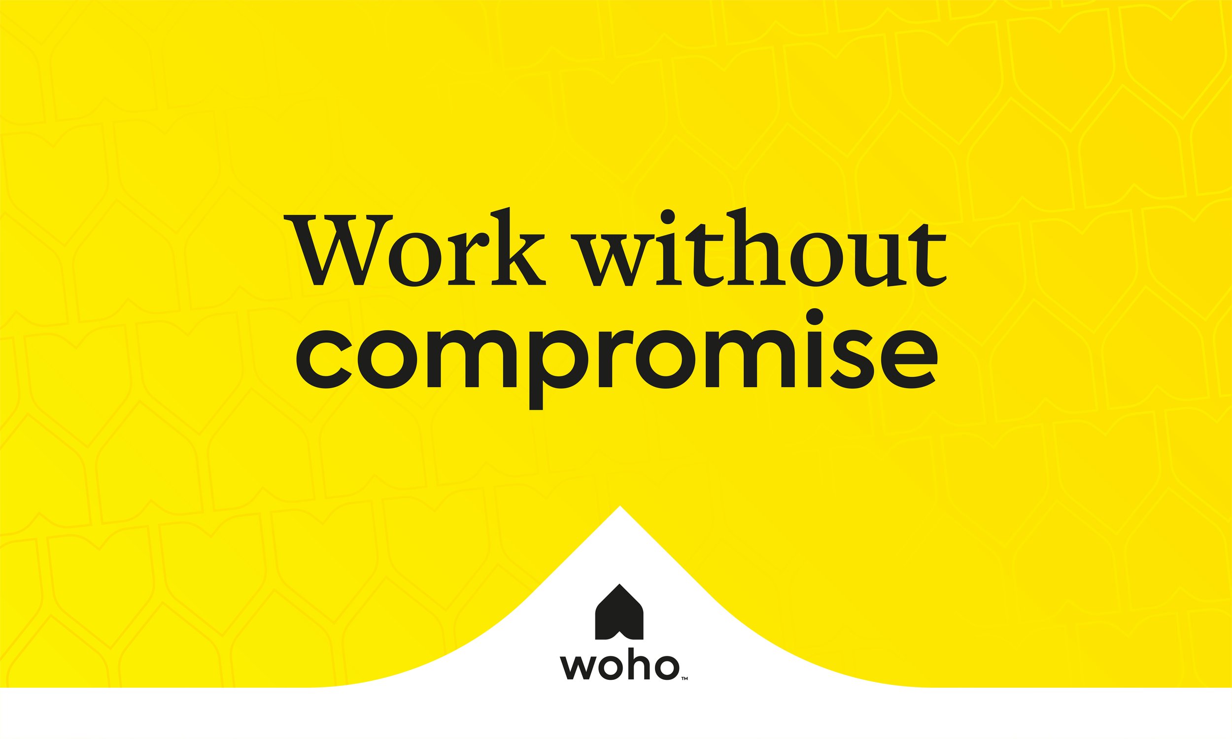
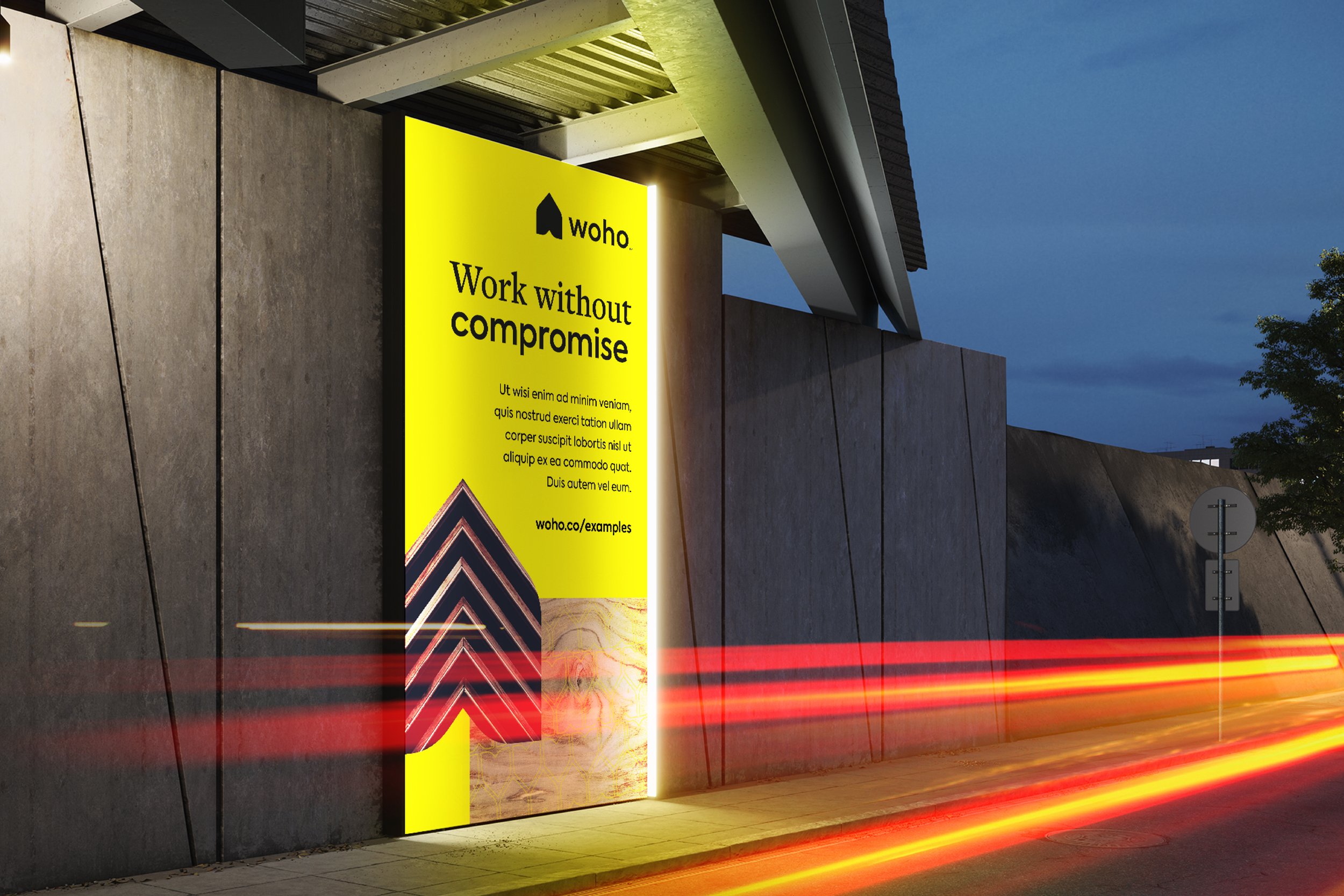
We carefully crafted the strategy behind the new brand identity, while Bourne & Bred took care of visualising our ideas and bringing them to life by focusing around the concept of flexibility and working from wherever you want, keeping in mind that no two people are the same and everyone works differently.
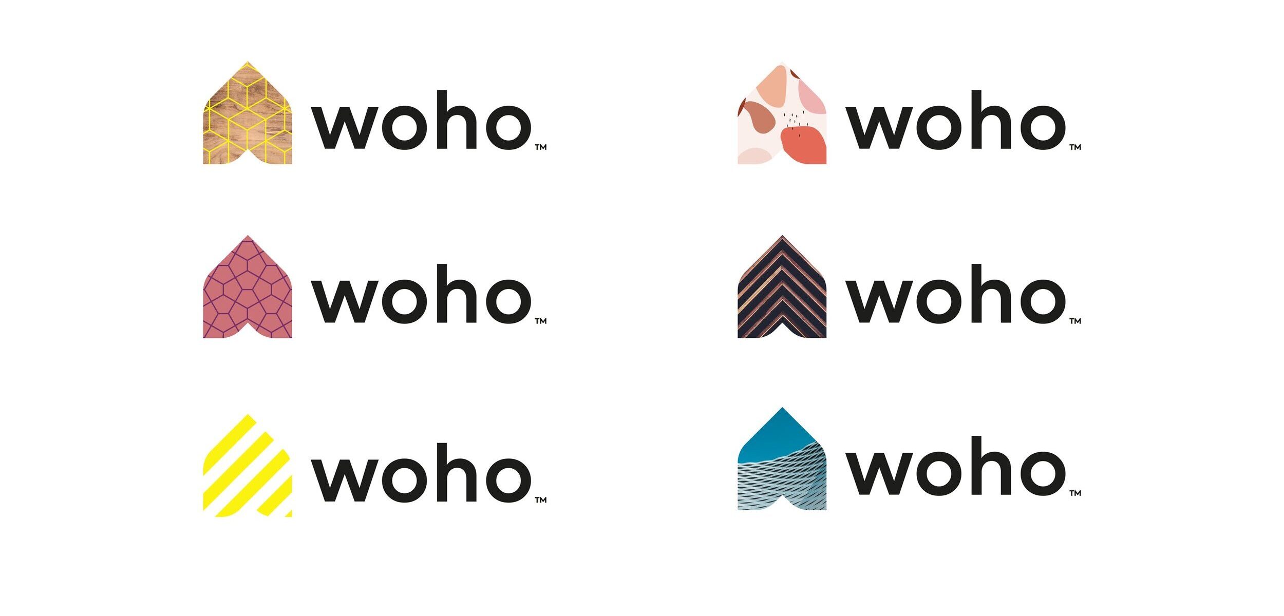
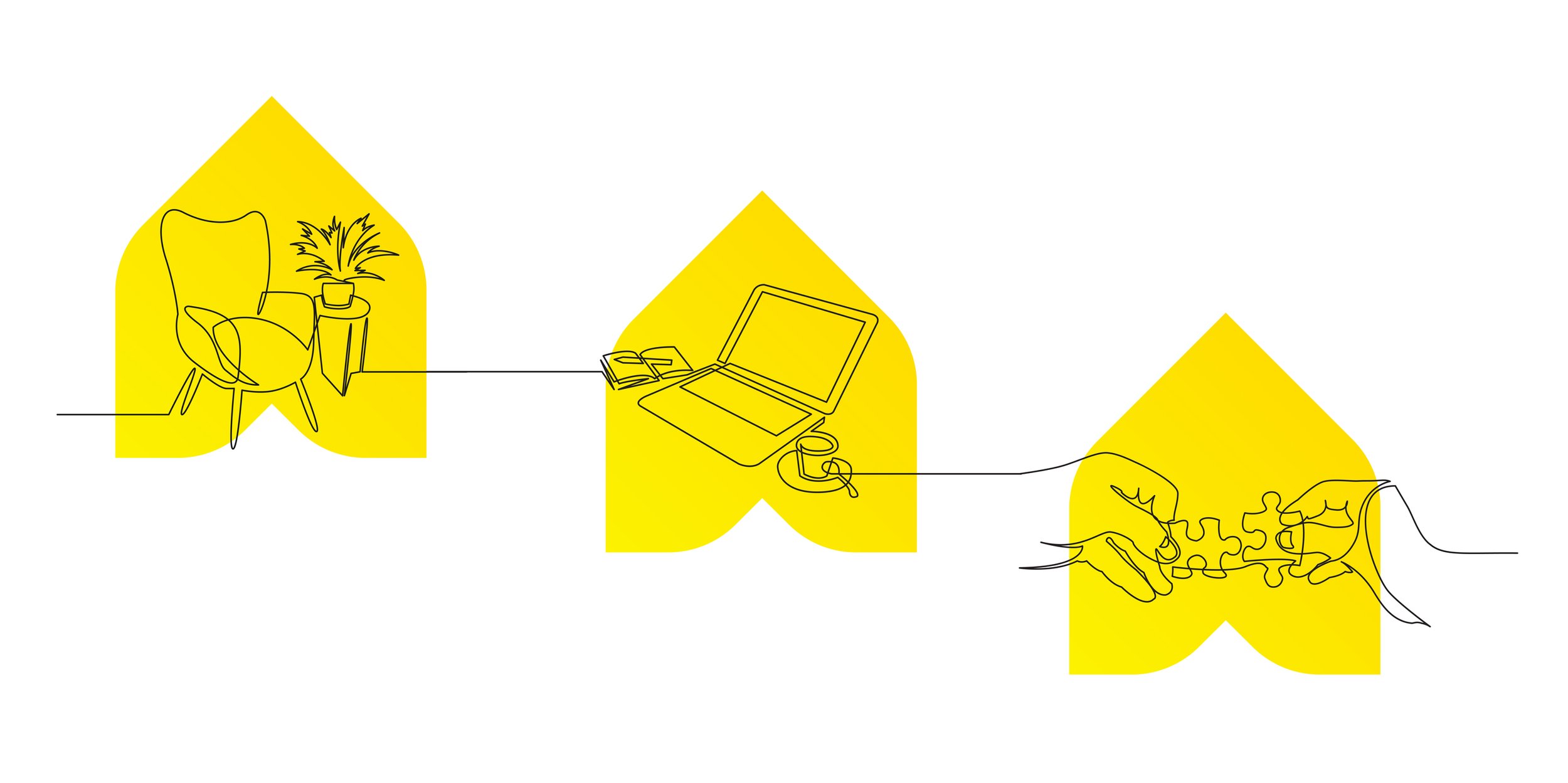
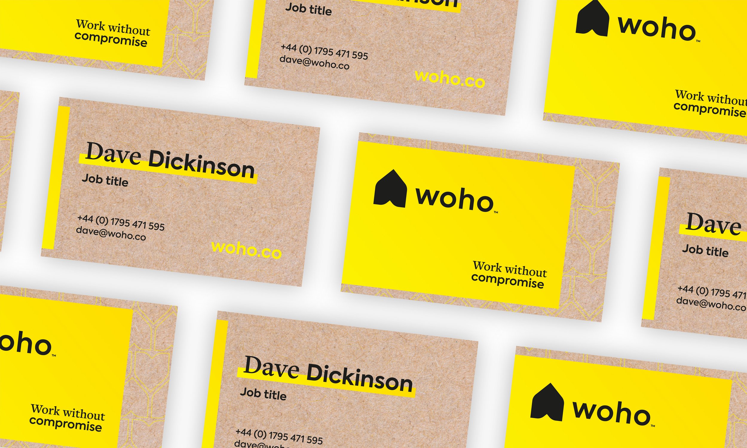
The shape of the logo is very simple and represents a ‘space’. Because people can fill their space however they want, the logo is also flexible and can be easily filled with textures, styles and graphics, meaning that the identity could adapt depending on the situation or audience.
Bourne & Bred chose an optimistic yellow as the core brand colour and then layered it with material textures, together with abstract shapes to create a visual depth wherever the identity was used.

The impact
We created the strong foundations for a truly flexible brand to enable this ambitious start-up to get out to market, yet stay flexible enough to evolve and develop as the business did.
This really is a well considered modern brand fit for the future of work.
"We were the typical client who believed they were aligned and knew what they wanted. We had even had a go at our own ‘brand on a page’, internally. Emma and her team brought rigour and professionalism and a natural rapport, expertly herding us cats and helping us articulate what we really wanted."
Mark Latham, Co-founder
Woho

Other Work
Wilton & Bain
Reimagining a heritage brand
YouTube
Programme identity with global impact